We recently collaborated with the kind folks at Prezi to create a webinar, From Pitch Deck to Visual Story. We were blown away by the response – 2600 registered, and 750 of you joined the call! Your presence became very real as questions and emails poured in.
As promised: Welcome to our super-secret follow-up resource page just for Prezi users!
During the webinar we outlined six design principles, which, even if you use only a few of them – will put you way ahead of most presenters.
(Below are four original presentations we’ve created for other clients, all but one in Prezi. Under each, we outline how each design follows the six principles. At the end, we repeat the presentation resources we offered during the webinar – all of them storytelling gurus, to whom we turn for our own inspiration.
Ready?
Here’s a recap:
- Find the Story
- Keep it Simple
- Make Data Visual
- Get Metaphorical
- Compose Your Frames
- Stay Consistent
You can read a more detailed refresher on Prezi content maven Chelsi Nakano’s blog post here. (Her post also has a replay of the original webinar.)
Note: Though our webinar focused on B2B pitches, these examples include stage talks aimed at entrepreneurs and businesspeople. (If you like these and want to poke around more, you’ll find lots more work here.)
Kate Purmal: The Vision Project
Kate Purmal is an unapologetic optimist and accomplished visionary who brings out the brilliance in leaders and their teams. A serial entrepreneur and CEO, Kate was also our business coach for several years and pretty much changed our life; she is now a trusted advisor, client, colleague, and friend. We had the honor of helping her bring her personal vision for this presentation to life. (Full project description here.)
1. Find the Story
This presentation is for women yearning to play bigger in their lives. This is the story Kate tells:
Though women are graduating and starting businesses at higher rates than men, they have a ways to go to reach parity in leadership. How to shift? A key deficit, according to one Harvard Business Review study, is their perceived ability to “envision.” The key question: Can vision be taught? According to Kate, the answer is yes.
Kate leads her audience through specific exercises to create and hone their vision, reinforced by stories of visionary founders, from Spanx's Sara Blakely to Palm's Jeff Hawkins. Once women have mastered visioning, Kate ends on a higher-order call to action: Leave a legacy, and mentor the next generation.
2. Keep it Simple
We wanted the audience to “get” Kate’s concepts immediately, grasping them on an emotional level and then focusing on her.
Images are either clean, conceptual photography or custom graphics against white background (lots of white space!) or full-bleed photos. Text is simple – usually one word or phrase per slide – and if we used a pull quote, we chose the most relevant, easily digestible excerpt. Statistics are judiciously used.
3. Make Data Visual
We honed Kate’s data points from a stack of research. Then we told a story.
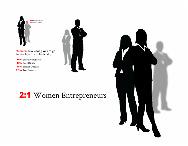
After a few slides to set the stage, we used data to tell the story of how far women have come (education, entrepreneurship), vs. how far there is still to go (leadership positions, earnings, and revenue-generating power). We laid data over gender-specific silhouettes, and used Prezi’s zooming and panning capabilities to create surprises and drive home the kicker points.
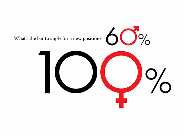
What’s the bar that each gender holds themselves to when applying for a new job position? We added gender types to the stats to add meaning and create simplicity. The nuance of the story came out in Kate's talking points.
4. Get Metaphorical
We made ample use of metaphor in Kate’s prezi.

The photo illustration above offered a metaphor that money is just a resource. We apply a lot of meaning to it, but really it’s like water. You can use it for the things you care about, or allow it to flow to someone who may not use it wisely.
Other metaphors in the presentation:
- Close-up of the eye as a metaphor for vision
- Egg timer as a metaphor for time moving at a glacial pace
- Compass as a metaphor for Kate’s navigation in her life
- Piggy bank as a metaphor for savings
- Scales with the weights inverted as a metaphor for business
- Sunset on the horizon as a metaphor for the act of visioning
- Chalkboard as a metaphor for creating an equation
- The “Box of Horribles:” A metaphor for how we create, and hoard, horrible fears and limiting beliefs
- Magnifying glass as a metaphor for examining your fears
- Shadow as a metaphor for leaving a legacy as a leader; the final zoom onto Kate’s daughter reinforced the concept of paying it forward.
5. Compose Your Frames
Each frame is composed with simplicity in mind. We generally try to keep frame elements to between three and five, having one main element to focus on with secondary elements shown smaller.
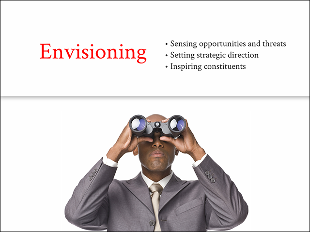
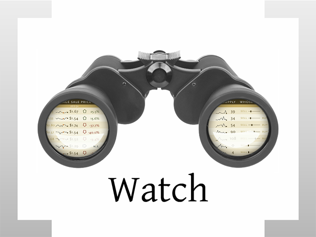
In the “Envisioning” frame below, we divided it vertically with the image of the man with binoculars on the bottom, looking up over the “horizon” and the title and bulleted list above.
6. Stay Consistent
We used the following to create consistency:
- Consistent font and colors (grey and black, with red emphasis)
- Imagery is either a simple silhouette with a white background or full-frame
- All imagery is crisp and high quality
- Prezi movement: Zooms to the right within sections for continuity of thought, then UP when we move to new ideas. We use judicious zooms in and out to illustrate key concepts.
Chip Conley: Creating Habitats for Innovation
1. Find the Story
Chip Conley teaches through story. In this presentation, his own story anchors the narrative: how he started out at age 26 with one hotel and no previous hospitality experience, and grew Joie de Vivre to become the second largest boutique hotel company in the world. In his role as head of Global Hospitality and Strategy at Airbnb, Chip continues his evangelism in speaking engagements around the world.
He supplements his lessons learned with those of other business masters, from Virgin’s Richard Branson to Southwest’s Herb Kelleher. Listening to these stories, audiences begin to see how they can create a habitat for innovation in their own companies. (Full project description here.)
2. Keep It Simple
This presentation focuses on simple, clean graphics, or full-bleed photos with minimal text. Pull quotes are succinct with lots of white space.
3. Make Data Visual
As we wrote this, we realized that Chip doesn’t have a single stat in this presentation!
This actually makes it a great example. Often, presenters can rely too much on stats to help them persuade. As a business leader, Chip’s quantifiable success gives his message automatic credibility.
Chip has given this talk to hundreds, probably thousands, of hard-core business types. And he doesn’t need wonky statistics to make his point. He makes it through his unique point of view, story, and provocative questions.
4. Get Metaphorical
Chip’s presentation is organized around three metaphors for creating habitats of innovation: The Farmer, The Anthropologist, and The Pioneer.
![]()
Each tells a metaphorical story:
- The Farmer: Culture is the fertile soil where innovation sprouts
- The Anthropologist: Understanding human needs leads to more differentiation and loyalty
- The Pioneer: Dare to pursue noble experiments

A chameleon is a great metaphor for a hotel employee who morphed to each culture he entered.
Other metaphors:
- Toilet seat with sanitary guard to represent the extent of hotel innovation before boutique hotels
- Campfire shot as a metaphor for a company culture
- A heart to represent the service profit chain (getting to the heart of your culture)
- Gift box wrapped in a bow as a metaphor for “offering your customers something of real value they haven’t yet imagined”
And of course: Maslow’s hierarchy of needs pyramid, as the central metaphor to represent turning one’s job into a calling (the cornerstone of Chip’s approach to business and life).
5. Compose Your Frames
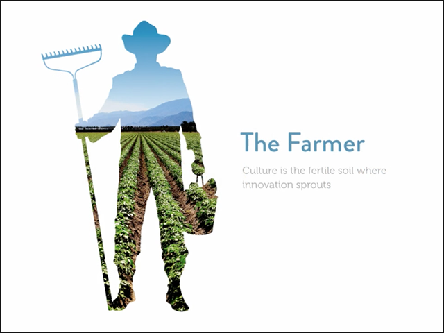
Here is a good example of a title slide with a simple three-part composition. The primary image builds upon the original farmer icon by including a photo inside the icon.
You can read the headline at the same time that you see the farmer silhouette, driving home a feeling for what the point really means. The secondary subhead in grey doesn’t distract, but can be read for more intellectual detail on the meaning of the title.
6. Stay Consistent
We stuck with a single font and used color, size and boldness to call attention to the main points for each bit of text. We used similar-feeling realistic silhouettes and kept our imagery colorful, full frame or cleanly silhouetted on a white or color background.
Mike Dreyfus: We Sell Experiences
Mike Dreyfus sells high-end real estate in Silicon Valley. His sales are some of the highest ever recorded in Atherton and Palo Alto. Walking into homes priced $3 million and up, Mike needs to quickly answer the question, “Why should I give you my business?” He wanted a new way of telling his story, different from the typical spiral-bound PDFs agents typically use. (Full project description here.)
1. Find the Story
As Mike’s potential client, the story I will tell myself:
If I’m a seller: Working with Mike, he’s going to “get” me, and “get” my home. I can imagine how he will stage and market it perfectly to my target, navigating the deal through unpredictable waters.
If I’m a buyer: Mike knows the market inside and out. He understands that I’m not buying a home: I’m buying the experience I want to have in my life. And he’ll help me make that experience a reality.
2. Keep it Simple
We organized the presentation around five “keys” to crafting your home’s unique story. Graphics are simple and clean, with lots of white space to focus on his core message.
The implication: Mike is so good at what he does, he doesn’t need a tsunami of information. He needs a few very clear points, each illustrated by three or four sub-points. For each point, we boiled down dozens of potential stories to tell the most powerful.
We took advantage of Prezi’s grouping and zooming capabilities so Mike could focus on the big picture if time is limited, or drill into details depending on where the prospect wants to go. Mike also presented the prezi on an iPad, tailored to a private home’s more intimate setting.
3. Make Data Visual
For this sales pitch, we focused on positioning statements and key points vs. stats and data points. Mike worked those into his pitch as needed. Statistical data like comparable home prices, selling rate, and market reach can come out as evidence in his talking points.
4. Get Metaphorical
We organized the presentation around keys – a metaphor for the literal keys to your home, as well as for the keys to how Mike works his magic, his keys to success.
We also uncovered and illustrated a navigation theme as key to how Mike operates, integrating visual metaphors such as compass, binoculars, a ship’s steering wheel, and a life vest (for when waters get choppy).
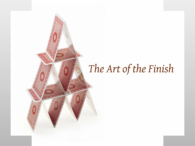
In the final frame, a carefully stacked deck of cards is a metaphor for the delicate closing process.
5. Compose Your Frames
Each sub-section has a single large anchoring image, with three sub-images. Each of the sub-screens has a single anchoring image or idea with supplemental text supporting it.
6. Stay Consistent
Mike’s brand is upscale and sophisticated, so we used fonts and colors that reflect that aesthetic.
We kept the colors in line with Mike’s brand guidelines, making sure that our graphics, layout, and imagery matched what he was doing with his marketing and print materials.
The nautical imagery is all of a similar visual language, and the theme conveys the idea that he is an expert skipper in a complex and fast paced business.
The overall message: “Mike knows what he’s doing; he will always show up at a consistent, high level of quality. I can count on him.” We also wanted the aesthetics to be simple and elegant, same as the homes he sells.
Motista: Bridging the Connection Gap
What makes you loyal to anything—a brand, a product, a person? Motista spent years in research and millions of dollars figuring out how. They knew they had a revolutionary product, but their linear, text-heavy sales materials were not getting through. We introduced more resonant graphics and illustrations, as well as developing a simpler language that fostered more immediate “aha!” moments and audience engagement.
Previously, pitches took the Motista sales team up to three meetings to get to the engagement stage. Now, within 30 minutes sales reps started hearing, “I get it. I want it. Send me a proposal.” That’s what we like to hear. (Full project description here.)
1. Find the Story
As Motista’s potential customer, the story I will tell myself:
Motista understands my issue: How do I get inside my customer’s head? They’ve figured out how to do it: by understanding the underlying emotions that drive behavior. By partnering with Motista, I can unlock key data that drives consumer behavior and connect with my customers (and potential customers) in a way I haven’t been able to thusfar.
2. Keep It Simple
Each frame makes ample use of white space. We also worked closely with the team to hone each frame to a single big idea.
3. Make Data Visual
Near the end of the presentation there is a great example of using simple bar charts to talk about significant research data.
We kept data points to a minimum and kept the colors minimal and consistent. Each chart’s look and feel is consistent with the presentation’s overall style color and fonts. Wherever possible, we used Prezi’ s zooming and panning features to give more life to comparisons and to call attention to key points.
4. Get Metaphorical

This slide is a good example of metaphor: unwieldy cardboard boxes as a metaphor for the old way of doing research.
Other metaphors within the presentation:
- Target as a metaphor for hitting the bull’s eye with customers
- Laid over the left and right quadrants of a brain: gears and cogs for analytical thinking, trees and nature as metaphors for emotion
- The woman with a combination dial on her forehead is a good example of metaphor: “unlocking” the right part of your customer’s brain, with a Prezi zoom into the lock as a metaphor for doing so.
- Megaphone as a metaphor for the customer evangelizing Motista to everyone who will listen
- Magnifying glasses as a metaphor for closely examining a topic. (This is also a good Prezi technique for running through “bullets” that don’t feel like bulleted points.)
5. Compose Your Frames
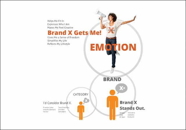
Here is a good example of composing frames to reveal a larger concept, and using Prezi’s unique panning and zooming capabilities to progressively reveal the larger concept. (Click through the actual prezi to see this at work.)
To get to this final frame, two previous clicks each add a little more information to the idea. In the last frame, each frame forms part of a three-part composition. The final frame trades in simple icons representing category and brand (less emotional) for an image of a real person (more emotional).
6. Stay Consistent
Motista is all about the science, data, and analytics behind the very emotional sales process, so we chose a bold sans serif font. When a company has particular brand guidelines relating to look and feel, we stick to those as closely as possible. In this case the key brand color was orange, so that’s what we used for emphasis in both text and graphics.
Resources
At the end of the webinar we shared our favorite storytelling colleagues and gurus. Here they are, live and linked.
One of the top presentation-training companies. Founder Peter Meyers’ book, As We Speak: How to Make Your Point and Have It Stick, is one of our go-to guides for presentation structure and delivery.
The company also offers affordable in-person weekend workshops. Peter comes correct with an impeccably trained staff, including many seasoned improv-comedy experts. We attended his annual August workshop at Esalen … worth the trip in and of itself.
Get Storied is one of the world’s leading schools for business storytelling, with 250,000 change-agents logging in each month. Founder Michael Margolis is currently on a storytelling world tour; watch for him in a town near you. And bring chocolate.
Nancy Duarte helped establish presentation design as a legitimate art form and essential influencer tool. She created Al Gore’s Inconvenient Truth presentation and has continued to blaze trails unlocking this craft’s potential.
Duarte Design offers online and in-person training as well as a top-shelf library of resources. Her book Resonate: Present Visual Stories that Transform Audiences is one of our personal favorites, as it plots any great presentation along the classic Hero’s Journey.
David Nihill is a fine Irishman and master storyteller, founder of FunnyBizz and author of Do You Talk Funny? 7 Comedy Habits to Become a Better (and Funnier) Public Speaker. The book “shows how the key principles of stand-up comedy can be applied to your speaking engagements and presentations to make you funnier, more interesting, and better looking. (Or at least two of the three.)”
Read his book to learn how to inject humor into any talk; hire David and his stable of comedy writers through FunnyBiz to make anything you write funnier.
Winning the Story Wars: Why Those Who Tell (and Live) the Best Stories Will Rule the Future
As cofounder and CEO of Free Range Studios, Jonah Sachs is responsible for the viral storytelling behind The Meatrix and Story of Stuff. Combining insights from mythology, advertising history, evolutionary biology, and psychology, Sachs shows businesses how to win “the struggle to be heard in a world of media noise and clamor.”
Brief: Make a Bigger Impact by Saying Less
From the book: “The only way to survive in business today is to be a lean communicator. Busy executives expect you to respect and manage their time more effectively than ever. You need to do the groundwork to make your message tight and to the point.… Long story short: BRIEF will help you gain the muscle you need to eliminate wasteful words and stand out from the rest. Be better. Be brief.”
Aaaaaaand with that reminder: We’ll sign off for now.
Work With Us
If you’re inspired by all this and want to explore collaborating with a professional team, we'd love to hear from you!
Our typical clients are executives delivering conference keynotes, influencers giving a TED/“big idea” talk, and founders prepping a VC pitch or a sales deck.
We take on a select number of new clients each year. If you think we may be a fit for each other, please reach out (info@alimat-inc.com or 510-680-5885) for an exploratory conversation.
OK. Go tell some stories.
~ Alison & Matt
Project: Visual Storytelling: Four Case Studies
Thanks: To our Prezi compadres Chelsi Nakano and Susannah Shattuck, for your most awesomenest collaboration.
“What was unique about Alimat is the combination of an unwavering commitment to delivering greatness, and the creative capacity to deliver it. Their approach rests on a blend of curiosity, collaboration and creativity to distill a message to its true essence. Their value to Kingfish went beyond sales and marketing. They helped us see ourselves more clearly and, as a result, informed our strategic approach.”

Jonathan Goldenstein and Christian Dubiel
Founders, Kingfish Group
“I thought it was only in romance that you could say he or she ‘could finish my sentences for me.’ I’ve come to learn that Alison and Matt don’t just finish my sentences, but they also create visual imagery and a storyline that is both profound and persuasive. Based upon my very enjoyable time working with Alimat, my speeches are more moving, more memorable, and pack much more meaning. I can’t say enough about these two.”

Chip Conley
Founder, Modern Elder Academy; Strategic Advisor for Hospitality & Leadership, Airbnb; Founder, Joie de Vivre Hospitality
My experience working with Alimat on our pitch deck opened my eyes to the power of great visual and verbal storytelling. Through an intensive interview process they came to understand me, Judicata, our history and our vision — and then surfaced the arc that unifies it all. I’m proud of the work they did, and what we produced together. It moved Judicata incredibly far forward, and showed me what is possible with an intelligent, creative, and talented team.

Itai Gurari
Co-founder and CEO, Judicata
